Photoshop Contest Forum Index - General Discussion - Art exhibition - Reply to topic
Goto page Previous 1, 2, 3 Next
which one ? |
1 |
|
50% |
[ 19 ] |
2 |
|
50% |
[ 19 ] |
Total Votes: 38
Micose

Location: Quebec (CAN) & France
|
 Wed Oct 10, 2007 1:22 pm Reply with quote Wed Oct 10, 2007 1:22 pm Reply with quote
Martrex wrote: I like the captivating eyes on number 2.
Don't they have those things called hand trucks over there metal stand and 2 wheels at bottom and handle at top. They have even collapsable ones here salesmen use them all the time to cart around cases of what ever product they are trying to sell to the officials in the offices. 
o think isee what u mean....gotta find one now...where could i buy this? 
|
ReinMan

Location: Kingston, ONTARIO, CAN
|
 Wed Oct 10, 2007 3:49 pm Reply with quote Wed Oct 10, 2007 3:49 pm Reply with quote
Well, Naiko - I like them both. This is what you do very well - good crazy paintings! 
But I pick #1.
(I don't know why you hang around here when there are many more "painterly sites" out there where you could become almost as famous as me  but I suspect you just like us here! but I suspect you just like us here!  ) )
_________________
_________________________________
THIS SITE REALLY DOESN'T EXIST
the way our EGO THINKS IT MIGHT!
_________________________________
|
billtvshow
Site Moderator

Location: North Carolina
|
 Wed Oct 10, 2007 5:07 pm Reply with quote Wed Oct 10, 2007 5:07 pm Reply with quote
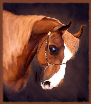
They are both strong, but I prefer the emotion revealed by the unexpectedly more detailed face in the 2nd one
|
marcoballistic

Location: I am everywhere, and Nowhere, but mostly, I am right here!
|
 Wed Oct 10, 2007 5:25 pm Reply with quote Wed Oct 10, 2007 5:25 pm Reply with quote
2 Naik, it has a better focal point and appeals more to me, something mesmeric about the eyes, very cool both of them though, but for me, its No. 2 
|
ReinMan

Location: Kingston, ONTARIO, CAN
|
 Wed Oct 10, 2007 5:37 pm Reply with quote Wed Oct 10, 2007 5:37 pm Reply with quote
looks like we have a horse-race!!!!
Once again, the crowd at PSC shows their varied talents and differences of opinion! Yay DIVERSITY!! etc. 
_________________
_________________________________
THIS SITE REALLY DOESN'T EXIST
the way our EGO THINKS IT MIGHT!
_________________________________
|
Heinlein

Location: Rochester, New York
|
 Wed Oct 10, 2007 6:17 pm Reply with quote Wed Oct 10, 2007 6:17 pm Reply with quote
They are both astonishing pieces, but number 2 seems to draw me in more.
|
nifft

Location: italy
|
 Wed Oct 10, 2007 6:24 pm Reply with quote Wed Oct 10, 2007 6:24 pm Reply with quote
number 2
_________________
Crime doesn't pay... does that mean my job is a crime?
|
NOGOODSK8RPUNK

Location: hum let me think, oh i know, if you look real hard i sometimes appear in your forum's text box
|
 Wed Oct 10, 2007 6:29 pm Reply with quote Wed Oct 10, 2007 6:29 pm Reply with quote
i like #1 but i think i voted for number 2  man i shouldn't be allowed to vote in these types of things
|
|
|
 Wed Oct 10, 2007 6:38 pm Reply with quote Wed Oct 10, 2007 6:38 pm Reply with quote
I like both actually, the second appeals to me due to the eye. But the first one looks (to me), well, 'nicer' to me in a whole concept.
Having difficulties chosing here.
So..., i picked #1, for the whole concept and because it's bigger and heavier to carry  
_________________
I used to do stuff around here
|
cafn8d

Location: Massachusetts
|
 Wed Oct 10, 2007 6:38 pm Reply with quote Wed Oct 10, 2007 6:38 pm Reply with quote
Micose wrote: to get an idea of the size, just put Cafn8d besides the canvas at the bottom....they are same size high....  ...146cm!
Hey! Don't make me bite you in the kneecap! Grrrrr!
  
|
Micose

Location: Quebec (CAN) & France
|
 Wed Oct 10, 2007 7:11 pm Reply with quote Wed Oct 10, 2007 7:11 pm Reply with quote
Im gonna wait a bit before i take my decision...;keep voting please... 
|
Micose

Location: Quebec (CAN) & France
|
 Wed Oct 10, 2007 7:14 pm Reply with quote Wed Oct 10, 2007 7:14 pm Reply with quote
cafn8d wrote: Micose wrote: to get an idea of the size, just put Cafn8d besides the canvas at the bottom....they are same size high....  ...146cm!
Hey! Don't make me bite you in the kneecap! Grrrrr!
  
i need that pic to show them Melissa u know! for art sake!   
|
Micose

Location: Quebec (CAN) & France
|
 Wed Oct 10, 2007 7:53 pm Reply with quote Wed Oct 10, 2007 7:53 pm Reply with quote
ReyRey wrote: I love #1
I think it's the colors that clinched it for me...so it might just be the photography that I like better. Are the colors pretty accurate to the originals?
pretty accurate but not that accurate.u have good eye.the 2nd shoulbe abit more contrasted...and on colours are less good than in reality too...
|
Goto page Previous 1, 2, 3 Next
Photoshop Contest Forum Index - General Discussion - Art exhibition - Reply to topic
You cannot post new topics in this forum
You cannot reply to topics in this forum
You cannot edit your posts in this forum
You cannot delete your posts in this forum
You cannot vote in polls in this forum
|


