Hi!

Since last September, I wanted to update my "Last day" chop.
http://photoshopcontest.com/view-entry/158112/last-day.html
That contest was in the middle of my vacation, so I never had chance to make some adjustments... I never had time after I came back. Yesterday, SCWIDVICIOUS asked me the PSD file of this entry. So I thought it was time to do it.
In September, I received some constructive comments about this image.
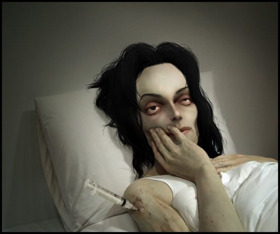
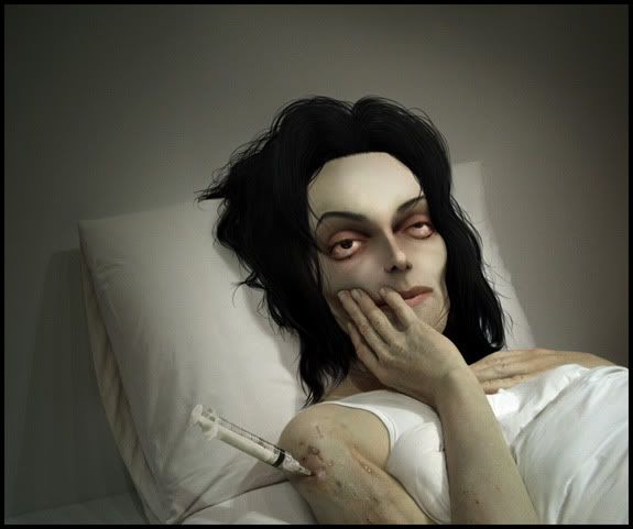
Seelcraft said the forehead was too high. Originally my idea was to make MJ a bit cartoon, not too realistic. I thought it was OK, but I finally tried a smaller forehead and I think it is better that way. Also Seelcraft said the eyes was too contrasty. For this detail, I made it this way and I keep it like it was. This effect was just to amplify the "very sick" mood.
Other comment from Granulated: "forearm and hand are a bit chunky". That is true! Granulated is one of the members who have very good eye. I made the adjustments.
Thanks Seelcraft & Granulated!
First version...
Final version...
The PSD file:
http://rwc3.webcargo.net/webcargo/d.php?x=1173279-0uxCIpM6HHuiT1s7vs
The best way to understand the work is to hide every layers and to show one by one from bottom to the top.
To see the new update to compare old and new version, you have only to click on & off the "last step" set of layers.
BTW, originally I dropped 3 pictures of MJ as references in my old PSD file. Maybe it makes someone confused.
Carmine665 PMed me and asked me if I used those pictures in my chop.
Those 3 pictures was only the best references I found on Google to built his whole head. All the face details & pixels are from the original source.
I used 2 externals...
http://i18.photobucket.com/albums/b112/Clafrance/ext1.jpg
http://i18.photobucket.com/albums/b112/Clafrance/ext2.jpg
Have a nice day!


