Prodominantly red... With veritical gradiation...
This style is very oriental and is pleasing to the eye..
Plenty of space for your GUI inc. Nav and various other abbrev,
Red draws the most attention in the picture but using it a a backkground makes anything in the picture stand out and white being the font choice is a good thing...
The readin edge of the picture draws the eye towards the titles and name, the contrast between both the title "Artist" and the name anchors them as two different things (not the best thing to do however the fact they are linked together negates this.)
rather unnescasssary picture in the corner just to ruin what could be a very sheik and functional design finest nice touch...
]
Ipoetschke next I suppose..
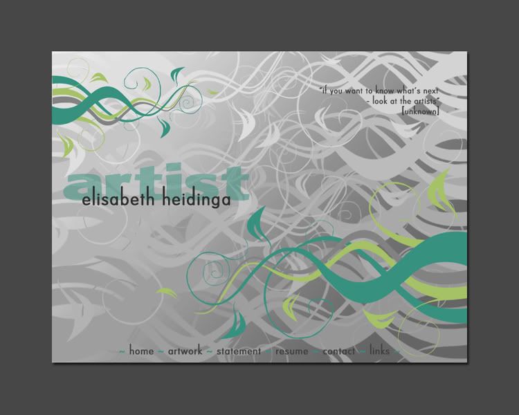
Going with grey background scheme seen in finestcalls... this one is sort of a polar opposite...
This uses a combination of neutral greens and cyans with greyscal to accomplish look.
Vectored background which would be perfect for an swf but a jpeg file online... may be bad for the slower broswers... only a minor thing.
The title is a good readble font and the name is anchored to it... conventional and recognisable style associated with artists before so thats bonus points for convention but no extra marks for origionality.
Navgation at the bottom of the page...
This could be potentially disasterousas potential visitotrs who have low screen res may not see it. or worse banner ads like google ads may push it so low it may be ignored...
Navigation is just ledigble but just is not enough nav should be plain and clear... and the sae goes for the text comment at the top which has no capital letter at the start...
Lastly for now there is
eragon
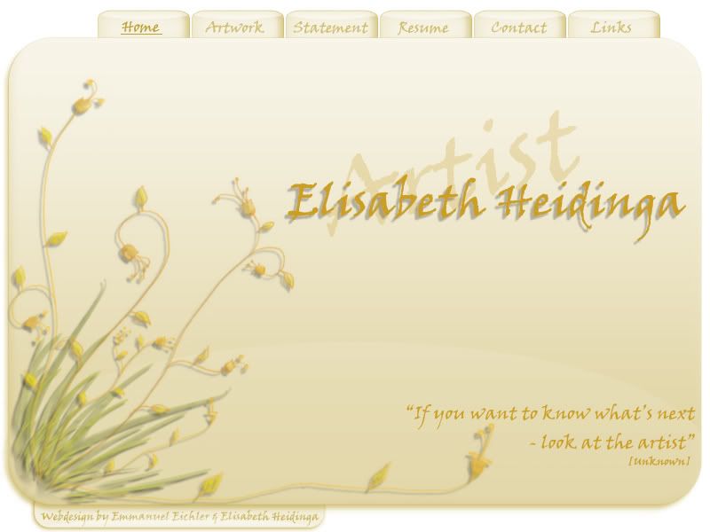
This image shows a yellow opal page... (I see a love of blending options) however that does not detract from the final look of the page, infact appropriate for the style used.
A pen drawn font for everything anchors all text together and keeps the site on a theme that bonus points there.
A subtle gradiation and solid for a nice background thats easy on the eyes and the picture at the left and base which guides the eyes dowon and across to both peices of text. that and extra bonus point for directional use.
a nice navigation at the top is easy to read and easy to find for any fully abled veiwer.
Few downsides for this one Prefered choice...although that text at the bottom is barly ledgable
Although finestcalls has the most potential


