I found it so hard to resist xD if anything it made me chuckle.
ReyRey if anything your a solid painter and that is something that takes a hell of a long time to get good at, problems always the little things when you get to your level and critique is hard to come by.
I would say the only things I see all to often in High level Photoshop drawings Are as follows
1)"Brand New Syndrome" - Objects that are either too clean or look like new.
I have done it, I know plenty of people who also do it, but the objects look more photo real with a bit of wear and tear, some staining or even a few knocks and bumps that's what made the space ships in the old star wars films look for gritty back in the day.
2)Lazy or overlooked edging on machined parts, all too often it's easy to forget with what is machined. A good rule of thumb it to hand-draw hand-made objects and vector draw machined parts, other wise uneven edging looks out of place on something that has gone through a factory machine, Sure wear and tear is one thing but an uneven edge looks out of place on something that has been turned on a precision cutter.
3)A final example of a high level photo-real editing misnomer is Depth of field, adding blur does not make Depth! I know it's a very tempting short cut, and it will fool a lot of users but if you want to go for high level it merely creates a focal point.
Depth of Field is a mixed range of focus and lighting. The backdrop and foreground levels need to be adjusted accordingly each element needs to be evaluated for levels of focus as every object will have a differing level of focus. After these levels have been chosen on a scale of 1(in focus) -10(out of focus)
Only then the type of blur can be chosen and it has to be very specific.
Graduated Gaussian alone does not cut it your blur needs to be selective.
Each object needs to be warped into either an Octagonal/Hexagonal shapes the reason being simply that an aperture of a camera is this shape and that is why the blur needs to be a series of blobs not a neat graduation of blur, it's a mistake a lot of high level photo shop experts ignore and is considered in the photography world a school boy error as all high level photographers know about the circle of confusion and the zone of acceptable focus that creates these circles of blur which create depth of field.
An example can be seen here in the back drop:
4)Finally last but not least, water, oh the tricky as f*** element akin to fire in difficulty.
Water is notorious, it reflects therefore can be a source of light but also is transparent which means you can see through it. It also refracts to there if a certain amount of Fresnel to add to distort/magnify a background object depending on the shape of it's container. After these painstaking effects have been added and again high level photo shoppers do add these effects there is always one that is missed.
It's important at the level of if we didn't have it in our bodies to create capillary action we would die, at the same time certain insects would be fucked and the Jesus lizard would be a pretty shit runner I am of course rambling about Surface tension.
A layer of skin to be precise, Depending on the density and transparency of the liquid involved there is a certain thickness to the surface this can be seen visibly and is oh so ignored when chopping or drawing. It's mainly picked up in wine glass chops but puddles, rivers, and even droplets have this layer of skin. and it is visible at the sides.
"Note" only really applicable in close ups or macro photo realism...
Here is a little bug on water

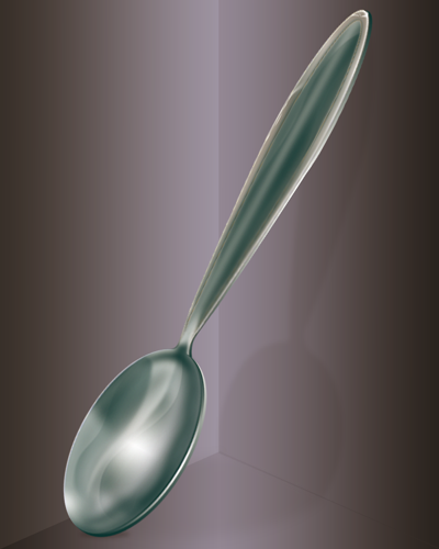
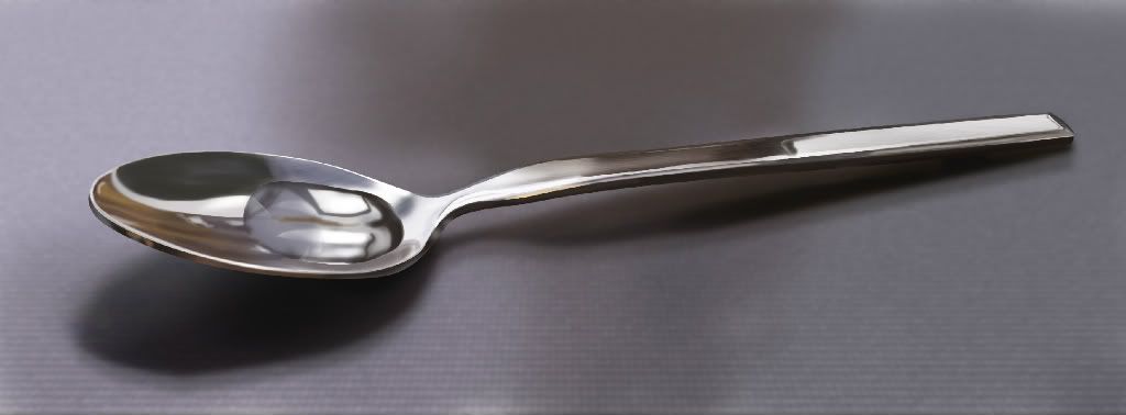
There are more examples of high level blunders but that concludes my willingness to rant for today, have a look again at the spoon and see if any of these things stand out?
At first glance based on the prior ravings the spoon edge could be more uniform (After all it's manufactured therefore the edges need to look a little more trim and even)
There could be some scratched in tea staining in the head and some knocks out the sides to show age as well as adding those depth of field markers namely lighting on the spoon being brighter after all it is made of a reflective material where is the glare!
Interesting to note the range of the photo and the light style used, it suggests that it's a relatively ranged key light from the back right mainly because the shadow is too dark to suggest soft box but not strong enough for pin light at close range.
With a secondary softer light from the back right closer and higher up creating the ghosted shadow.
The sheer fact that the whole spoon fits in the image, and the size of the image coupled with the detailing means that the only kind of lens to opt for an image at this range without crop would have to be a wide angle macro lens and therefore be on a native D.O.F. setting of about f2-4.0 that suggests at that macro-photography D.O.F. range the spoon would also have blurring on it any wide angle macro lens would have a very strong D.O.F. at that range so try adding some in and finally with wide angle macro photos there is warping. add a little see how it looks for photo real then.
With crop I would suggest either a 50mm on F1.8 still have blurring or Tele-macro about 70-300mm in which case the floor needs to be in a sharper focus around the spoon instead of the immediate foreground other than that.
Spoon as it stands is very good as a quick piece of work.
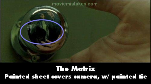
As a side note, these things are for all choppers to take note of but don't ignore the massively obvious stuff for the intricacies like the reflection of a chopped in object, in the only mirror in your background image I mean it was bad enough you could see the camera man in the door knob in the matrix facepalm.


