Photoshop Contest Forum Index - Ask the Experts - Can I get some tips on this image? - Reply to topic
Goto page 1, 2 Next
delia

Location: Near Albany, NY
|
 Fri Mar 14, 2008 10:13 am Reply with quote Fri Mar 14, 2008 10:13 am Reply with quote
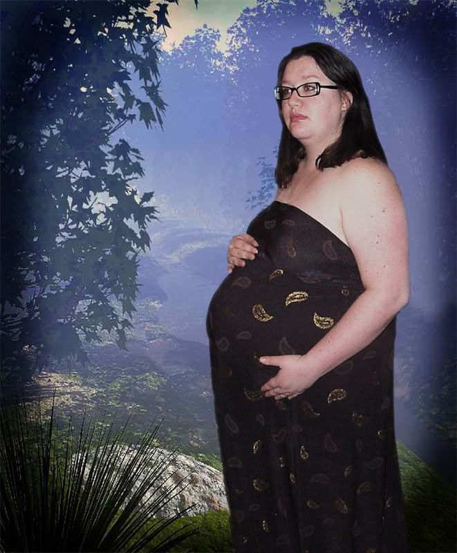
This is one of my internet friends. This pic was taken in her living room with a lot of back clutter etc. She wanted a different background, and I am trying to give her an "earthy" feel, very soft and misty, so I think I have the right background for the image, but I am feeling like she doesn't look truly integrated, just like she is cut and pasted there.
I feathered her a pixel or 2, but I am not sure what else to do here. Any tips, suggestions, or helpful hints I can try out?
|
yello_piggy

Location: Vienna/Austria/Europe
|
 Fri Mar 14, 2008 10:17 am Reply with quote Fri Mar 14, 2008 10:17 am Reply with quote
try less black in the black, less contrast, and/or more of each in the background
|
|
|
 Fri Mar 14, 2008 10:18 am Reply with quote Fri Mar 14, 2008 10:18 am Reply with quote
Colors aren't matching up too well for me...
|
delia

Location: Near Albany, NY
|
 Fri Mar 14, 2008 10:21 am Reply with quote Fri Mar 14, 2008 10:21 am Reply with quote
Well, the more I look at it, the scale doesn't seem right either, she is too close in the foreground for that image, I guess....
Any links to a forest grotto looking image I could use for free that might work?
|
|
|
 Fri Mar 14, 2008 10:23 am Reply with quote Fri Mar 14, 2008 10:23 am Reply with quote
maybe ti's the fog that is doing her in? She has such a patterned dress on that a subtle quiet background would focus more on her and less on what's behind her-hth
|
TofuTheGreat

Location: Back where I belong.
|
 Fri Mar 14, 2008 10:23 am Reply with quote Fri Mar 14, 2008 10:23 am Reply with quote
The background seems flat to me. Like a wall mural. This could be that there's a mist on the foliage but not on/around her? Also the general lighting and color ranges don't match.
You could try adding in a cabana/hut frame between her and the background? Make it look like she's in a vacation resort?
_________________ Why I do believe it's pants-less o'clock! - Lar deSouza
The mind is like a parachute, it doesnt work if it isnt open. - Frank Zappa
Created using photoshop and absolutely no talent. - reyrey
|
blue_lurker

Location: Australia
|
 Fri Mar 14, 2008 10:28 am Reply with quote Fri Mar 14, 2008 10:28 am Reply with quote
Tone the background down to a much darker tone and soften h edges of your friend with a little blur...try to take he hi-lites from here face so she looks more glowy that white and a little pasty..if you know what I mean...its all to stark and in your face to me...but then what the freak do I know Im just here cause I got no where else to go...lol
|
the burning couch

Location: I don't know, but it sure is dark in here
|
 Fri Mar 14, 2008 10:59 am Reply with quote Fri Mar 14, 2008 10:59 am Reply with quote
Darken her up a bit and a little lower contrast ....and I'd get rid of the dark vignette also.
_________________
Half of writing history is hiding the truth.~ Mal
|
|
|
 Fri Mar 14, 2008 11:04 am Reply with quote Fri Mar 14, 2008 11:04 am Reply with quote
I would first try to match up the temperature of the light. The background is a cool temperature, while the woman is warmer from the flash used. The black blurry border doesn't work for me, it appears as though it was added in a hurry. I would also recommend blurring more of the background to create depth and to put more focus on your subject, unless you are seeking the look of someone standing in front of a painted wall.
|
|
|
 Fri Mar 14, 2008 11:19 am Reply with quote Fri Mar 14, 2008 11:19 am Reply with quote
The way she is facing the light makes it difficult to blend her into a background. This is a challenge. 
|
delia

Location: Near Albany, NY
|
 Fri Mar 14, 2008 11:20 am Reply with quote Fri Mar 14, 2008 11:20 am Reply with quote
Thanks everyone for the good tips.... I'll play more with it this afternoon! I appreciate the ideas.
|
delia

Location: Near Albany, NY
|
 Mon Mar 17, 2008 2:11 pm Reply with quote Mon Mar 17, 2008 2:11 pm Reply with quote
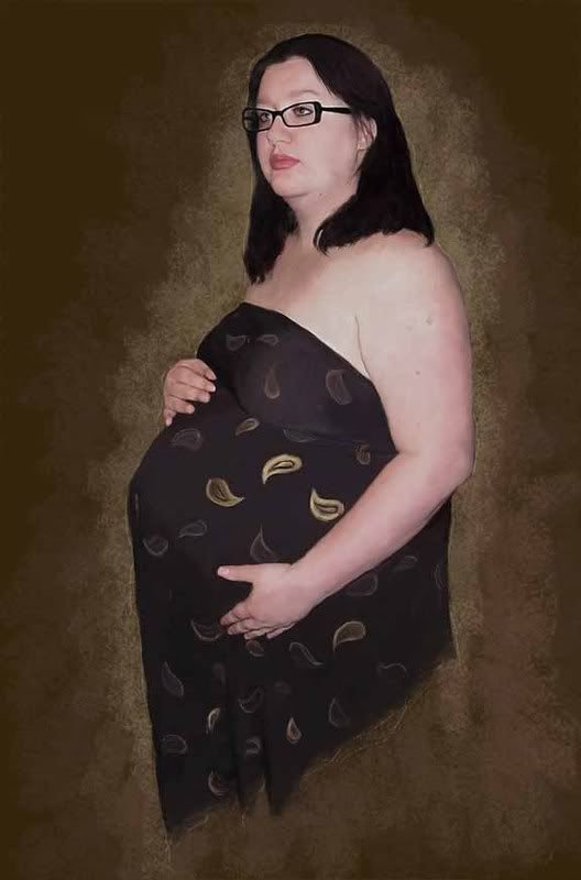
I'm just not getting what I want from this pic, despite all the good tips you all shared.... So, I stuck with what I know.
Thanks for all the ideas, I just couldn't execute it.
Anyway, if you are interested, here is the final image (shrunk down to 25%) looking much better without the living room in the background.
|
ScionShade

Location: VeniceFlaUS
|
 Mon Mar 17, 2008 4:42 pm Reply with quote Mon Mar 17, 2008 4:42 pm Reply with quote
uhhhmmmmmmmmmm. don't be mad at me for being observent, but
I see a sheet, no stitching, just folds, and the outline of a pillow.
Hand placement was very unusual. not quite cupping, but holding in place.
|
TutorMe
Site Moderator

Location: Sitting in this room playing Russian roulette, finger on the trigger to my dear Juliet.
|
 Mon Mar 17, 2008 4:47 pm Reply with quote Mon Mar 17, 2008 4:47 pm Reply with quote
ScionShade wrote: uhhhmmmmmmmmmm. don't be mad at me for being observent, but
I see a sheet, no stitching, just folds, and the outline of a pillow.
Hand placement was very unusual. not quite cupping, but holding in place.
If it were a sheet, I'd think there'd be more folds.
|
Goto page 1, 2 Next
Photoshop Contest Forum Index - Ask the Experts - Can I get some tips on this image? - Reply to topic
You cannot post new topics in this forum
You cannot reply to topics in this forum
You cannot edit your posts in this forum
You cannot delete your posts in this forum
You cannot vote in polls in this forum
|


