By: Fugue
I'd like to talk about the importance of perspective - often the most forgotten ingredient in PSC entries (with reflection and shadow realism a close second/third).
Have you ever looked at an entry and thought "something looks wrong
here, but I can't quite put my finger on it"? Well, 9 times out of 10,
it's probably a perspective problem.
Sometimes you can cheat or "force the perspective" without it being
an obvious problem, just as you can cheat the realism of
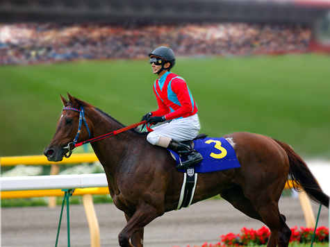
shadows/reflections to some degree. A recent contest example is
illustrated by this entry of Patre's, which did quite well:

Being a secure and well-adjusted newbie, Patre welcomed my comment
and asked for clarification of this issue, so here we are. The
perspective problem here is caused by a conflict between the camera
point-of-view (POV) in the original background image versus the new
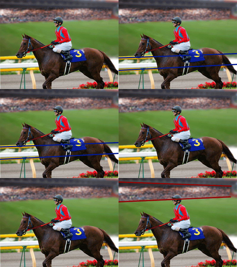
source (foreground). One POV is higher than the other. The tell-tale
signs are the areas I've highlighted below plus what can be seen of the
horse itself:

Note how in the foreground, the side rails on either side of the
track (flashing blue) are vertically close together - indicating that
they are approaching alignment with the horizon. Also note that we can
see little of the top of the horse's body (we are not looking DOWN onto
the horse at all) - indicating that the horizon runs through it
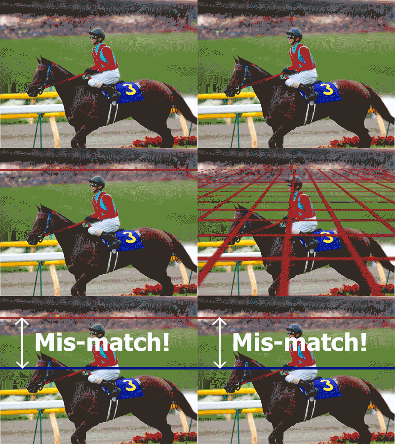
somewhere. These, and similar key pointers in the background image,
allow us to project an imaginary horizon-line for each POV:

The mis-match between the 2 camera POV's (and their horizon-lines)
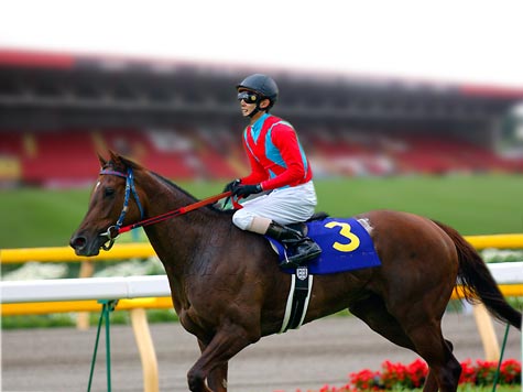
is what causes the final image to look odd. To remedy this, we can move
the original background image down so that its horizon approaches the
same level as the new foreground image:

So... when choosing a compatible source image to combine with
another, ask yourself "Does the camera have a similar enough
point-of-view in each image?"... and discover the joy of good
perspective.
� all photoshop tutorials
|