Photoshop Contest Forum Index - Featured Pic - Choice of image to place in contest.. - Reply to topic
Goto page 1, 2 Next
Patre

Location: Glendale, Az.
|
 Wed Apr 30, 2008 9:43 am Reply with quote Wed Apr 30, 2008 9:43 am Reply with quote
Thanks to all who voted and commeneted on "The dawn's first light " entry. It is almost ironic that that image ended up collecting as many votes as it did. I had several different
versions of the image, and in fact, originally posted a version that I liked better than the one that finally ened up as the entry in the contest. I first posted a version titled "sunset light", and then reposted the "dawn's early light"version after both of my children said they liked it better than the sunset version I first posted.
Has anyone ever had a similar experience where you first posted a version of the image that you thought was the best one, only to change it later on the advice of family etc, who liked another version better. If you did, did the voting results ironically support the entry you didn't think would collect the most votes?
Attached are two other versions of the "Dawn's light" entry, so you can understand what I mean.
[img] [/img]
[img] [/img]
|
marcoballistic

Location: I am everywhere, and Nowhere, but mostly, I am right here!
|
 Wed Apr 30, 2008 10:03 am Reply with quote Wed Apr 30, 2008 10:03 am Reply with quote
you chose the right one Pat 
|
abraham

Location: Someday I'll be home for good.
|
 Wed Apr 30, 2008 10:25 am Reply with quote Wed Apr 30, 2008 10:25 am Reply with quote
This actually happened with my last winning chop. You know how I always update my entries  . Marco knows this because he voted the original one then I changed it 
|
Mir

Location: Malta E.U.
|
 Wed Apr 30, 2008 11:01 am Reply with quote Wed Apr 30, 2008 11:01 am Reply with quote
You did good to change it Pat, I think the colours changed the whole mood and it is much more intriguing now. Same as with Abraham's the colours tell a different story in these images, The blue one gives a feeling of cold, it makes one feel that this is somewhere in the arctic while the other one has a more sinister feel to it. Congratulations on the win Pat.
|
Patre

Location: Glendale, Az.
|
 Wed Apr 30, 2008 1:10 pm Reply with quote Wed Apr 30, 2008 1:10 pm Reply with quote
Thanks Marco, Mir and Abraham for your responses! It really reflects for me how valuable the opinion of more outside objective viewers can be. And Abraham, I liked your switch too. In my view,The brown image is the more visually powerful one. Which all goes to show, I guess, that,sometimes, we are not altogether the best judge of our own work.. 
|
Micose

Location: Quebec (CAN) & France
|
 Wed Apr 30, 2008 1:33 pm Reply with quote Wed Apr 30, 2008 1:33 pm Reply with quote
due to some of kinda of visual (but not only...)complexity(maybe u noticed) I naturally tend to produce, my choice is often based on the next question : "should I post it cuz im kinda surprised by the result...i found some new techniques etc...? OR I post the simplified version, or this more "classic" job for being appreciated by the most?" most of the time my answer iss "fuck it"... still time to time ( for the Price contests mainly) I tend to pick the more "classic" one....
and Congrats Pat"""yea!
|
Patre

Location: Glendale, Az.
|
 Wed Apr 30, 2008 2:15 pm Reply with quote Wed Apr 30, 2008 2:15 pm Reply with quote
Naiko,I can understand how a really talented and gifted artist like yourelf might experience some genuine anguish at having to make a choice between posting something classic and something that is very good, but which the viewer might not understand and appreciate. It probably feels like you are abandoning a part of your true self when you post the more common(classic) image as compared with the inspired work that is the heart and soul of your creative genius. The artist who is ahead of his "time" may often be born too early for money and fame and not late enough to earn even a respectable name...
On the other hand, being true to oneself can be one of the happiest life decisions a person can make. My hunch is that great artists like yourself compromise and do what they/you need to do to survive,managing a career that caters to the public interest, while at the same time creating work that may take years and/or even centuries to be appreciated for what it is really worth.
|
NOGOODSK8RPUNK

Location: hum let me think, oh i know, if you look real hard i sometimes appear in your forum's text box
|
 Wed Apr 30, 2008 3:14 pm Reply with quote Wed Apr 30, 2008 3:14 pm Reply with quote
pat those other 2 are nice as well but i'm glad you stuck w/ the blue i feel it the most pleasing of the 3 to the eye grats 
|
dewdew

Location: Upstate South Kack-a-lack
|
 Wed Apr 30, 2008 4:52 pm Reply with quote Wed Apr 30, 2008 4:52 pm Reply with quote
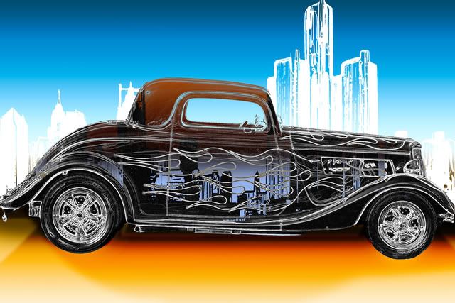
I was going to post this in the h2h....but did'nt......  I think it would have done better...still some flaws....it was a work in progress.....WAS being the key word. 
edit:....sorry, i did not think of posting the one i did go with.....does make it rather hard to compair with only one.  ....now i took whole different road when i did this one....which is the one i entered.
|
Patre

Location: Glendale, Az.
|
 Wed Apr 30, 2008 5:08 pm Reply with quote Wed Apr 30, 2008 5:08 pm Reply with quote
Dewdew,
I like your jalopy image. I honestly can't remember what your original submission was, so I can't make a very subjective comparison choosing which one I would have preferred. However, nice work on this image!
|
LGyecallekim

Location: Reynolds-Tucky! Booooooo
|
 Sun Jun 01, 2008 8:00 pm Reply with quote Sun Jun 01, 2008 8:00 pm Reply with quote
so i take it you have to be an advantage member to even have a chance at winning right. i feel like ive been robbed a couple times. and working hard on projects just to get like 3 votes, makes it a bit discouraging. do i just suck at photoshop or something, tell me how to improve so my experience here can be more worth it
|
|
|
 Sun Jun 01, 2008 8:11 pm Reply with quote Sun Jun 01, 2008 8:11 pm Reply with quote
What exactly are you robbed of? You enjoyed doing the chop I think and you have something to show for it. That is really how you should look at this, not about votes. You haven't lost money so who robbed you?
It just takes some persistence here and patience.
|
Tawiskaro

Location: New York
|
 Sun Jun 01, 2008 8:18 pm Reply with quote Sun Jun 01, 2008 8:18 pm Reply with quote
LGyecallekim wrote: so i take it you have to be an advantage member to even have a chance at winning right. i feel like ive been robbed a couple times. and working hard on projects just to get like 3 votes, makes it a bit discouraging. do i just suck at photoshop or something, tell me how to improve so my experience here can be more worth it
We've had some non-advantage winners. Everyone gets robbed. Everyone works hard and gets three votes. Everyone gets discouraged. There are many things you can do to improve, but the two most important in my judgment are: 1) keep chopping despite failure; 2) spend as much time as you can studying the images that have won.
Now, STFUAC!

|
Goto page 1, 2 Next
Photoshop Contest Forum Index - Featured Pic - Choice of image to place in contest.. - Reply to topic
You cannot post new topics in this forum
You cannot reply to topics in this forum
You cannot edit your posts in this forum
You cannot delete your posts in this forum
You cannot vote in polls in this forum
|


