Ok... let's give this thread a new perspective... how NOT to make a comment...
I'll use my good friend Mr Marco "I'm So Popular It Hurts" Ballistic (from now on mentioned as Mr M only for reading purposes) and TeaMan, who created this thread. Please, understand I have no intent to depict TeaMan's entries... I just picked him cause he started the thread. Could be anyone. In the other hand, Mr M's comments is just another thing on this poor brit soul that pisses me off.
Introduction:
Mr M has been an example to this community, as a person and MAINLY as a Chopper. For such a great chopper, his comments MUST be valueable in some way. I mean, a comment coming from such a great chopper MUST be taken seriously, don't ya all agree with me? Well... I wasn't the one who spotted him as the BEST chopper in PSC... you guys did it, and honestly, I have NO IDEA why... Anyway, let's take a look at some Mr M's comments on some of TeaMan's entries... please, again, this is no personal attack on TeaMan, just an explanation on how comments should NOT be made.
Example #1:
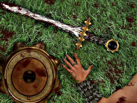
Mr M: should be competing for the win, amazed it is not
Wow!! Mr M, the greatest chopper of all times think this should be competing for the win. This HAS TO BE PERFECT!!! Am I missing something????? Am I???
Well... no I'm not. This should NOT be competing for the win... it's a good chop indeed, but far from deserving the win. Why? I'll tell you why. If you REALLY want to teach or learn something, you have to learn first to recognize yer flaws. In this case... the arm looks flat. It looks flat cause there are no shadows nor highlights in the arm (and bracelet, which has metal parts that should have bright highlits, like in the sword... light doesn't affect just certain parts of yer chop...) to give depth to it. It is plain. Solution? Look at the general lightening in the entry, and tweak it with dodge and burn until it looks like the arm is actually an arm of a soldier laid in the ground. What else is Mr M missing to think it should be competing for the win? Let's see... the blood... but wait... Mr M is the MASTER of blood??? How come he didn't notice the blood in the grass looks like thrown mud???? I dunno. Solution? Making blood in a grass field is not so easy as it looks... the blood should be on the grass, not on the field, in the shape of several mounts of mud. It should also not be blurred at all. Ok, the color might be correct for dry blood, yet the consistence looks like mud. I could go on and comment on how the shield has no highlights, how the shadow is not casted right, and so on... but I think this is enough to say it should NOT be competing for the win... YET, Mr M is AMAZED this is not competing for the win... HOW SO???? He's a Grandmaster!!!! HE CAN'T BE WRONG!!!! The answer for these questions, I'll never know...
Bottomline... if the chop has a good effort, a good idea, but it's filled with flaws, don't say it should be a winner... say "nice effort", "good idea", make some remarks on what could be done to make it better, but don't call us retards saying it should win the contest... sucking people's balls won't help them to improve...
But let's go on... i have a few more examples on how NOT to do a comment...
Example #2:
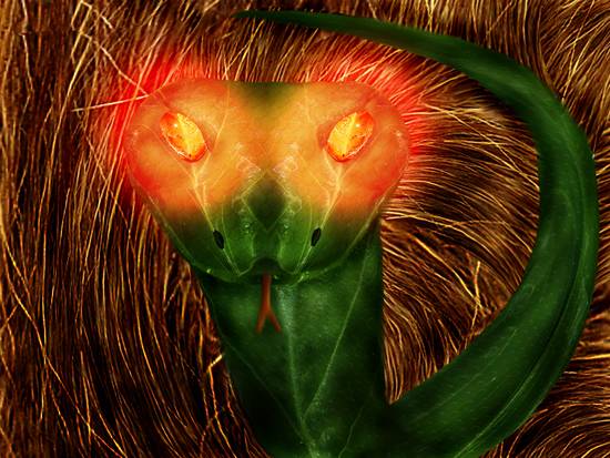
Mr M: superb creativity T, this is very good

Ooooook... I just miss the part where transforming a leaf into a snake is SUPERB CREATIVE!!! Heck... even I already transformed a sidewalk into a snake... but let's focus on the comment. Superb... wow!!! That's a nice word isn't it?? But seriously... is it superb creative??? No... it's not... and it's also not very good... seriously... if the entry was called slug in the brush, maybe could be more creative... again the same mistakes... no shadows or highlights that give depth to the sneak... the glows in the eyes are disturbing. Specially cause it practically burns the brush in the background, yet there's no sign of the red light that should be coming out from the eyes in the snake body. The tongue looks like someone put a stick in the snake mouth. Solution? Sure... first, dodge and burn are your friends. Possibly two of the most importants tools at PS (Reysquared did a tornado out of these two tools, for instance). And they're great to give volume to stuff... try to look at the snake and picture where the light comes from... apparently, it's hitting all the scene from the front, yet, the snake head is lifted... light doesn't go through snake heads... snake heads are not translucid. Keep that in mind. Second, glows are usually light sources... and if it's glowing THAT much, it should really affect the environment. Again... this is NO personal attack on TeaMan. I really didn't want to do this, but I felt in the need of showing people that sometimes, people just say you did a FABULOUS work, even knowing it's badly done. But hey... don't ya like having yer balls rubbed??? Huh, huh?
Bottomline: if an entry is not creative nor nicely done, don't say it's SUPERB CREATIVE or VERY GOOD... just say it's a good entry and point the flaws... unless you want people to like you instead of learning something...
Let's go to a 3rd and last example....
Example #3:
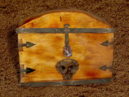
Mr M: liking this idea, good shadow all sits right, nice work T

GOOD LORD!!! ARE YOU RETARD OR ARE YOU BLIND???? Good shadow???? All sits right????? This is another attempt to make the choppers balls feel good. Unless Mr M is a complete retard, he does know the shadows are all wrong, and that the chest looks flat, not close of sitting right... Yet... he seems to love to make people love him... I mean, who wouldn't love a guy that simply "understands" the greatness of your chop... even when even you know it IS NOT good? the chest does not look integrated to the ground... the ground is viewed from the top... the chest is viewed from the front... the shadow hints it's supposed to be viewed from the front. It just doesn't fit!! Solution? Get a background in the same viewport as your chop. The only way it would sit right, would be if it was buried with the front of the chest up, and still, the shadows wouldn't match. So it's kinda silly to make the chopper believe they did everything right, cause he did not... far from that. I still wonder WHY Mr M, who is a powerful chopper, very skilled, who won WOW so many contests, thinks the shadows are great and all sits together. But if I didn't have a clue about what was wrong, I would believe there was nothing wrong... cause the eyes of AN EXPERT said it was PERFECTLY shadowed!!!
Bottomline: WE ARE NOT RETARDS!!! Keep that in mind.
Conclusion: Constructive criticism is based on pointing the flaws and how you should fix it. People tend not to like when someone points their flaws. In real life, try always to look at the positive aspects of a person and point it out, instead of just pointing out their flaws. But in chopping, it's essentials to know what you're doing wrong to be able not to do it again. You don't have to say something is beautiful or perfect, when you know it's not... that will captivate the chopper, but won't help him improve AT ALL. If you're in here to learn, just ignore comments like these when you see them in your entries. Instead, try to focus on comments that actually will help you improve. Remember kids... you don't use your balls to chop, so there's no need to have them rubbed, kissed or sucked to become a better chopper.
Cheers.
arc
ps TeaMan... sorry if this offended you in any way. It wasn't the real intent. But hey... even science needs lab rats...


