Photoshop Contest PhotoshopContest.com
Creative Contests. Real Prizes. Essential Resource.
You are not logged in. Log in or Register


Photoshop Contest Forum Index - Ask the Experts - Logo... - Reply to topic

Goto page Previous  1, 2, 3  Next

Martrex

Location: California

Post Fri Mar 18, 2011 11:50 am   Reply with quote         


I agree work the ark more as the image of arc easy to remember now what comes to mind with it is if the arc was made of cells for the animation??

My thoughts only Very Happy Very Happy


ReinMan

Location: Kingston, ONTARIO, CAN

Post Fri Mar 18, 2011 12:29 pm   Reply with quote         


Since there is very little image usage of an accordion in these logos being presented, I fear they are all doomed to failure.

There. I've stated the obvious.

Raising Brow


_________________

_________________________________
THIS SITE REALLY DOESN'T EXIST
the way our EGO THINKS IT MIGHT!
_________________________________
Marx-Man

Location: The United Kingdom!

Post Fri Mar 18, 2011 2:27 pm   Reply with quote         


I would have to agree Pakimo... The font is a bit default.

Impact was used for it's relative density.

The spacing of the font was meant to continue the underline and act as a lower case for weighting so when the image was read from left to right the words read out comfortably whilst keeping the logo looking like a separate part.


Having looked for an appropriate font, I think this one suits.


_________________

TofuTheGreat

Location: Back where I belong.

Post Fri Mar 18, 2011 2:37 pm   Reply with quote         


Marx-Man wrote:
I would have to agree Pakimo... The font is a bit default.

Impact was used for it's relative density.

The spacing of the font was meant to continue the underline and act as a lower case for weighting so when the image was read from left to right the words read out comfortably whilst keeping the logo looking like a separate part.


Having looked for an appropriate font, I think this one suits.


Looks like the logo of a shitty production house that makes 70's and 80's B-class movies.

Kinda reminds me of these:
http://3.bp.blogspot.com/_Tt8VPGIfM2E/S77ZEy6fVoI/AAAAAAAABD4/HHSPxeqBRAA/s1600/PDVD_030.jpg
http://i.ytimg.com/vi/_04eveJa2mk/0.jpg


_________________
Why I do believe it's pants-less o'clock! - Lar deSouza
”The mind is like a parachute, it doesn’t work if it isn’t open.” - Frank Zappa
Created using photoshop and absolutely no talent. - reyrey

Marx-Man

Location: The United Kingdom!

Post Fri Mar 18, 2011 2:52 pm   Reply with quote         


That's what I was going for ^_^

But seriously the Logo is for my name and like this for a reason, aside from business cards & referencing my site, the actual animated states on my name within the site are going to animate when the flash elements are made.

The gimmick is time-line motion.

Hence the symbol in the Square.


So this logo has been designed with that flexibility in mind.

The colour scheme also depends on the state of motion.

The idea is simple and the implementation is also simplified, eventually it will have gel effects but for now, the fundamental shape and feel needs to be perfected.

Logo designs I intend to be functional as well as aesthetically meaningful and ironically recognisable aren't easy to make.

The default part of the element is Paused.


_________________

janetdog

Location: Las Vegas Baby!

Post Fri Mar 18, 2011 5:27 pm   Reply with quote         


Before you go all crazy and have a bunch of cards printed, Remember that phone #'s, email, etc has to be included. Maybe you should see how all that mess works on a complete card.


_________________
chop chop
blue_lurker

Location: Australia

Post Fri Mar 18, 2011 7:54 pm   Reply with quote         


janetdog wrote:
Before you go all crazy and have a bunch of cards printed, Remember that phone #'s, email, etc has to be included. Maybe you should see how all that mess works on a complete card.


For a long time business cards were my bread and butter.
I found that the kiss method worked well.
Keep It Smart & Simple (Yes I know there are other words that fill this acronym) Smile

You need to remember that the card is for one purpose only, and that's to get your information to your client. You may have the most witty clever and artistic designed card in the world, but if your client has to spend more than a few seconds finding your email or Number, it fails as a card. (Btw black backgrounds on cards makes the text look crowded and difficult to read because its a reducing color, that's why us fat bastards love wearing black Laughing )

Im not going to comment on your design idea, artistic design can be a very personal thing just wanted to pass on what I have learnt over the years and what worked and what did not.

Hope that helps a little


_________________

Paul Von Stetina

Location: Deep Shit

Post Fri Mar 18, 2011 7:58 pm   Reply with quote         


blue_lurker wrote:
janetdog wrote:
Before you go all crazy and have a bunch of cards printed, Remember that phone #'s, email, etc has to be included. Maybe you should see how all that mess works on a complete card.


For a long time business cards were my bread and butter.
I found that the kiss method worked well.
Keep It Smart & Simple (Yes I know there are other words that fill this acronym) Smile

You need to remember that the card is for one purpose only, and that's to get your information to your client. You may have the most witty clever and artistic designed card in the world, but if your client has to spend more than a few seconds finding your email or Number, it fails as a card. (Btw black backgrounds on cards makes the text look crowded and difficult to read because its a reducing color, that's why us fat bastards love wearing black Laughing )

Im not going to comment on your design idea, artistic design can be a very personal thing just wanted to pass on what I have learnt over the years and what worked and what did not.

Hope that helps a little


Do you have a card? Laughing


blue_lurker

Location: Australia

Post Fri Mar 18, 2011 8:14 pm   Reply with quote         


yep and it was shit
I made it to crowded and the detail was hard to read.
but I had 500 printed so I was sorta stuck with em

Numbers and email are no longer valid.
I have moved on since then.
I always liked this one


_________________

Marx-Man

Location: The United Kingdom!

Post Fri Mar 18, 2011 9:31 pm   Reply with quote         


That card is wonky Blue... I can spot that with my; 'It's got something inherently wrong with it' senses from across the globe...

The text on the Email isn't aligned with the text on Australia 6155.
Same with the Fax no. and Canning Vale...

Yet Catalano Road and the mobile is fine...


I remember Fractured Pixel...

I also remember thinking that the logo for that shouldn't have been a camera but a plain square with a crack running through it or bits breaking off it...
Ya'know... Like a sort of... Fractured Pixel... Laughing

Looked sort of like this...

In fact that Logo has stuck in my mind now for what, 2... maybe.. 3 years?
That's some staying power. :-/

Good thing you stuck with the Camera man... That has forget-ability, that's what you want in a logo... Forget-ability Wink

But yeah I will post the card design when I finish honing this logo.


_________________

blue_lurker

Location: Australia

Post Fri Mar 18, 2011 9:59 pm   Reply with quote         


Well both cards are over and done now
I now have the old generic white card black type basic Blah card.
Serves it purpose...I keep getting people calling me for work... Wink


_________________

Marx-Man

Location: The United Kingdom!

Post Fri Mar 18, 2011 10:37 pm   Reply with quote         


This is the Alpha Design... It's not finished yet because my address is due to change.


Also copy the picture URL into here...
http://zxing.org/w/decode.jspx

Here is the picture URL...
http://img33.imageshack.us/img33/4789/picture137b.png


This is not my final design but an Alpha prototype.

My cards may have a scan-able impression so I can either, keep track of who I gave my cards to a later stage or write hidden messages...


_________________

supak0ma

Location: Photoshop Nation

Post Sat Mar 19, 2011 8:59 am   Reply with quote         


what does B.A. mean and why is it bigger than your logo? not diggin the color scheme


Post Sat Mar 19, 2011 10:05 am   Reply with quote         


Business cards are 90% of my sales. Your logo is fine for them imo. It is also perfect for how you described its use. I'm mostly paper products so I see things different. Never took into accoucnt the heavy web base use you were gonna use.


Post Sat Mar 19, 2011 10:17 am   Reply with quote         


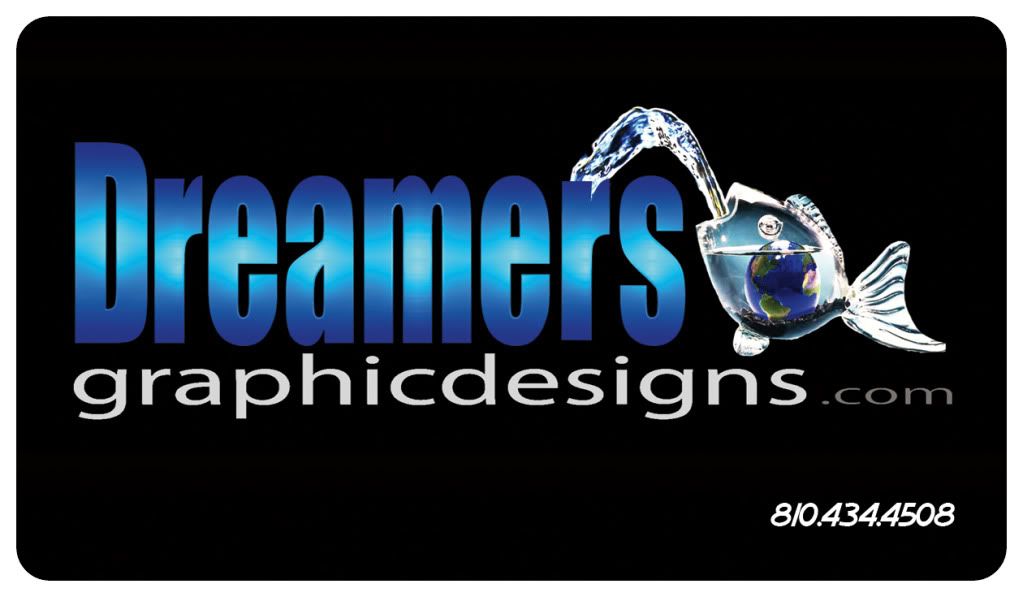
This is my card. Clear plastic, phone number is white from this print file, its actually not printed, its clear. I got more coming next week, I'll post pics when they arrive.

I figure I do graphics, my card sells itself. No need for extra BS on it. Paid all my bills over the winter with this card, 4-5 sales a week just from my card.

I know Marx, I know, its not a logo Smile

I think your black and red would look devistating on a frosted plastic card with the scan bar on the back.


Goto page Previous  1, 2, 3  Next

Photoshop Contest Forum Index - Ask the Experts - Logo... - Reply to topic

You cannot post new topics in this forum
You cannot reply to topics in this forum
You cannot edit your posts in this forum
You cannot delete your posts in this forum
You cannot vote in polls in this forum


Navigate PSC
Contests open  completed  winners  prizes  events  rules  rss 
Galleries votes  authentic  skillful  funny  creative  theme  winners 
Interact register  log in/out  forum  chat  user lookup  contact 
Stats monthly leaders  hall of fame  record holders 
PSC advantage  news (rss)  faq  about  links  contact  home 
Help faq  search  new users  tutorials  contact  password 

Adobe, the Adobe logo, Adobe Photoshop, Creative Suite and Illustrator are registered trademarks of Adobe Systems Incorporated.
Text and images copyright © 2000-2006 Photoshop Contest. All rights reserved.
A venture of ExpertRating.com