Photoshop Contest Forum Index - Ask the Experts - Monitor Question - Reply to topic
Goto page 1, 2 Next
cringer8

Location: Seattle
|
 Sun May 20, 2012 2:14 pm Reply with quote Sun May 20, 2012 2:14 pm Reply with quote
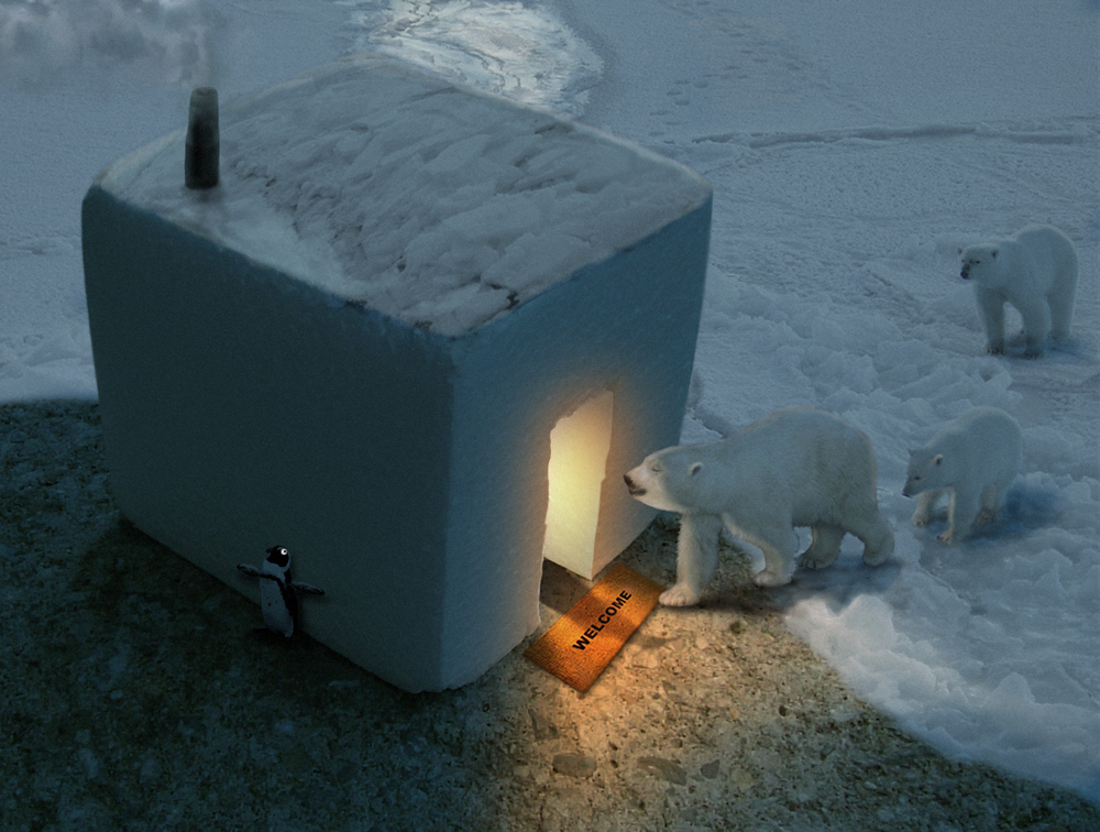
So I just worked up a nightime entry (my first). I used a dark blue photo filter layer adjustment, a gradation map, and desaturation to achieve the affect. On my monitor it looked pretty damn good, like the hour after dusk. I was pleased.
I posted my entry only to discover that people couldn't see a damn thing. I was floored. It's a JPG and I could see every single detail on my screen; every blade of grass. What gives? Can my monitor really be that off? Now I'm worried about my other entries. Were they just as ridiculously dark? When I adjusted the aforementioned image, it doesn't really look like "night" anymore on my screen. I'm just blindly hoping it looks better on everyone else's.
Can anyone tell me if there is something I can do to make sure that my settings are more "universal?" I might just avoid doing dark chops 
|
|
|
 Sun May 20, 2012 2:41 pm Reply with quote Sun May 20, 2012 2:41 pm Reply with quote
cringer8 wrote: So I just worked up a nightime entry (my first). I used a dark blue photo filter layer adjustment, a gradation map, and desaturation to achieve the affect. On my monitor it looked pretty damn good, like the hour after dusk. I was pleased.
I posted my entry only to discover that people couldn't see a damn thing. I was floored. It's a JPG and I could see every single detail on my screen; every blade of grass. What gives? Can my monitor really be that off? Now I'm worried about my other entries. Were they just as ridiculously dark? When I adjusted the aforementioned image, it doesn't really look like "night" anymore on my screen. I'm just blindly hoping it looks better on everyone else's.
Can anyone tell me if there is something I can do to make sure that my settings are more "universal?" I might just avoid doing dark chops 
I'm not really sure about the monitor as sometimes my work looks good on my monitor but then when I go say to an internet cafe, colors etc never look right.
But in regards to your work, first thought is since its a night time shot, why shouldn't it look dark but then when I looked again I noticed 2 guys on roof, (it definitely looks better large} so just a suggesting, maybe you could have the guys with torches so it just adds a little more light and puts more focus on the source(house) hope that makes sense
|
cringer8

Location: Seattle
|
 Sun May 20, 2012 3:31 pm Reply with quote Sun May 20, 2012 3:31 pm Reply with quote
Mel47 wrote: cringer8 wrote: So I just worked up a nightime entry (my first). I used a dark blue photo filter layer adjustment, a gradation map, and desaturation to achieve the affect. On my monitor it looked pretty damn good, like the hour after dusk. I was pleased.
I posted my entry only to discover that people couldn't see a damn thing. I was floored. It's a JPG and I could see every single detail on my screen; every blade of grass. What gives? Can my monitor really be that off? Now I'm worried about my other entries. Were they just as ridiculously dark? When I adjusted the aforementioned image, it doesn't really look like "night" anymore on my screen. I'm just blindly hoping it looks better on everyone else's.
Can anyone tell me if there is something I can do to make sure that my settings are more "universal?" I might just avoid doing dark chops 
I'm not really sure about the monitor as sometimes my work looks good on my monitor but then when I go say to an internet cafe, colors etc never look right.
But in regards to your work, first thought is since its a night time shot, why shouldn't it look dark but then when I looked again I noticed 2 guys on roof, (it definitely looks better large} so just a suggesting, maybe you could have the guys with torches so it just adds a little more light and puts more focus on the source(house) hope that makes sense
When I read that, I thought, "why would they use torches when they could use a flashlight?" and then I remembered that parts of the world call flashlights "torches." I'm such an idiot  Thanks for the tip. I'll give them some flashli.... er, torches 
|
TheShaman

Location: Peaksville, Southeast of Disorder
|
 Sun May 20, 2012 3:33 pm Reply with quote Sun May 20, 2012 3:33 pm Reply with quote
looks better here on my macbook. on my IBM its still really dark though.
I didn't see the guys or the ladder until the second update and not until I looked on my Mac.

night time images are tricky at best. you want them dark, yet you want everyone else to see the picture.
You almost have to cheat. Yes it needs to be dark, but you need really bright areas to make up for that.
making the night atmosphere blue instead of black helps as well.
|
seelcraft

Location: High Bridge, New Jersey
|
 Sun May 20, 2012 9:47 pm Reply with quote Sun May 20, 2012 9:47 pm Reply with quote
TheShaman wrote: looks better here on my macbook. on my IBM its still really dark though.
I didn't see the guys or the ladder until the second update and not until I looked on my Mac.

night time images are tricky at best. you want them dark, yet you want everyone else to see the picture.
You almost have to cheat. Yes it needs to be dark, but you need really bright areas to make up for that.
making the night atmosphere blue instead of black helps as well.
Good tip, Shaman! Hopefully standards will never come to PSC. I'm tired of dealing with them almost all my professional life.
Doug
_________________ Seelcraft
Chemists have solutions!
|
YerPalAl

Location: On Deck, South by Southeast
|
 Mon May 21, 2012 6:24 am Reply with quote Mon May 21, 2012 6:24 am Reply with quote
Its not just monitors either, a lot depends on video cards and then there is how does the person looking at your image have their settings modified. (you know, those little lightness and contrast settings on every monitor and computer)
So, no. There IS no way to assure that everyone has the same view, so the above advice is your best. Welcome to the frustration club, it has a lot of members.
Having said that, there are applications to calibrate your monitor, Spyder comes to mind. (its sitting on a shelf right above my work station) but it only calibrates YOUR monitor so it does nothing about other people's computers.
This is why I hate online graphics. Give me print work where if a project comes out poorly you can ask Mr. Printer what the hell happened.   
_________________ YerPalAl
--------------------------------------------------------------------------------
I'm highly motivated to be un-ambitious today.
|
Tesore

Location: On the way to Utopia!
|
 Mon May 21, 2012 11:56 am Reply with quote Mon May 21, 2012 11:56 am Reply with quote
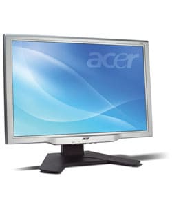
I love my Acer 24-inch Widescreen Flat Panel LCD Monitor.
@ Work i have the hp-w2558hc-widescreen-flat-panel-monitor.
I have no probs with dark images, except it's dark 
I saw the guys on the roof.
Maybe it's time for the 26" 
Is there a 28" already?
|
|
|
 Mon May 21, 2012 1:20 pm Reply with quote Mon May 21, 2012 1:20 pm Reply with quote
Watch it and weep!
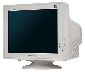
90% of my chops are done on this piece of crap...
...but that is not the reason 90% of my chops are crap also 
|
Trann

Location: Canadian Prairies, eh?
|
 Wed May 23, 2012 1:52 am Reply with quote Wed May 23, 2012 1:52 am Reply with quote
Pro Tip: Mac vs. PC Gamma.
|
Employed Droid
Location: france
|
 Sat May 26, 2012 7:51 am Reply with quote Sat May 26, 2012 7:51 am Reply with quote
bonjour,
could someone explain how I can start new thread on front page. I am new user here.
thanks
|
irgum

Location: Hungary
|
 Sat May 26, 2012 8:15 am Reply with quote Sat May 26, 2012 8:15 am Reply with quote
bonjour,
If you mean you would like start a new topic then click on the "post new topic" top of the this page or any others forum topic
I like your avatar 
|
Employed Droid
Location: france
|
 Sat May 26, 2012 8:26 am Reply with quote Sat May 26, 2012 8:26 am Reply with quote
irgum wrote: bonjour,
If you mean you would like start a new topic then click on the "post new topic" top of the this page or any others forum topic
I like your avatar 
merci, irgum. silly me, it was staring me in the face 
|
Goto page 1, 2 Next
Photoshop Contest Forum Index - Ask the Experts - Monitor Question - Reply to topic
You cannot post new topics in this forum
You cannot reply to topics in this forum
You cannot edit your posts in this forum
You cannot delete your posts in this forum
You cannot vote in polls in this forum
|


