Photoshop Contest Forum Index - Featured Pic - a creation of mine - Reply to topic
Goto page 1, 2 Next
|
|
 Sun Aug 12, 2012 9:12 pm Reply with quote Sun Aug 12, 2012 9:12 pm Reply with quote
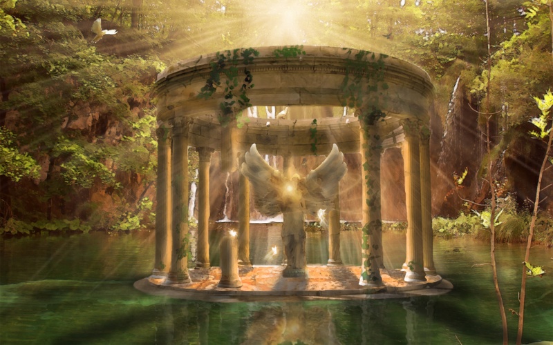
hello guys been elsewhere these last days , but i am back and made a fantasy picture just for you
now it is not what i had in mind , totally a different pic yet i am proud since i actually done this and finished it .
since i love fantasy like landscapes and picture , i did this one though i didnt get the perfect resources for it .
now i wanted to add some live creatures to the image and a path leading to the temple yet it was difficult and i am tierd
i printed the painting like feature on it to make it more fantasy like than real , maybe in the near futur ama add some myst what do you think?
oh and any critics are more than welcome if they are constructive of course .
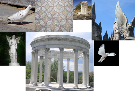
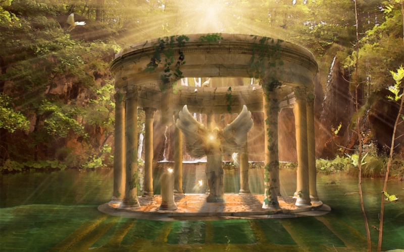
EDIT : minor modification were made on the image , corrected the reflection and added on important fact none of you noticed the reflection of the statue and its magic, i also emphasized on the shadows and here is the list of externals used
|
kinetic_be

Location: Belgium
|
 Sun Aug 12, 2012 9:22 pm Reply with quote Sun Aug 12, 2012 9:22 pm Reply with quote
It has potential but with every strong light comes strong shadows and that's what I would fix at first.
|
roger1

Location: Seattle, WA (US)
|
 Sun Aug 12, 2012 10:17 pm Reply with quote Sun Aug 12, 2012 10:17 pm Reply with quote
Looks pretty cool. The main issue that I notice right away is the reflection of the columns. They don't line up with the actual columns and I don't think the reflection should fan out the way it does. Shouldn't they be straight and desaturated a bit? The columns would also cast a shadow on the water (separate from the reflections). The water under the gazebo should be shaded as well.
|
rockyjob

Location: Anywhere but where I am.
|
 Sun Aug 12, 2012 10:27 pm Reply with quote Sun Aug 12, 2012 10:27 pm Reply with quote
The main problem is the reflection. It should be vertical and lined up. Also the closer it gets to the edge of the image the more transparent it should be. 
|
|
|
 Mon Aug 13, 2012 9:51 am Reply with quote Mon Aug 13, 2012 9:51 am Reply with quote
as for the shadows they exist but apparently not that visible
i will deal with the reflection
|
kinetic_be

Location: Belgium
|
 Mon Aug 13, 2012 11:14 am Reply with quote Mon Aug 13, 2012 11:14 am Reply with quote
Yeah, the reflection too, but I thought that was obvious 
As for making the reflection, make sure you reflect in straight angles. Your reflection can never be wider than the original source that is reflected.
Also keep in mind that there is movement in the water, which will make your pillars in the back (smaller ones) hardly visible and all pillars will have displacement.
|
ShootHerman

Location: Norway
|
 Mon Aug 13, 2012 12:04 pm Reply with quote Mon Aug 13, 2012 12:04 pm Reply with quote
killswitchengage wrote: hello guys been elsewhere these last days , but i am back and made a fantasy picture just for you
now it is not what i had in mind , totally a different pic yet i am proud since i actually done this and finished it .
since i love fantasy like landscapes and picture , i did this one though i didnt get the perfect resources for it .
now i wanted to add some live creatures to the image and a path leading to the temple yet it was difficult and i am tierd
i printed the painting like feature on it to make it more fantasy like than real , maybe in the near futur ama add some myst what do you think?
oh and any critics are more than welcome if they are constructive of course .
[/img]
Why dont you use your creativity/skills at the contests instead?
Come on...
SH
_________________
Fuck Putin. ....and btw, fuck Trump as well.
|
Sh!Za

Location: Right here
|
 Mon Aug 13, 2012 12:11 pm Reply with quote Mon Aug 13, 2012 12:11 pm Reply with quote
waaay to many light beams! lightbeams can result for example by gaps in trees or clouds and so you will never have such evenly light beams! (use the mask-tool!)
otherwise absolutely agree with kinetic / rockyjob about shadows and reflections
_________________
When I walk across the water, then my critics say, he can't even swim!
|
|
|
 Mon Aug 13, 2012 1:09 pm Reply with quote Mon Aug 13, 2012 1:09 pm Reply with quote
thnx shootherman , i try my best yet sometimes i cant use my creativity on specific contest because it doesnt help me
@sh!za : well this is the whole point of a fantasy manipulation , i know there is too much light , but hey if i delete them it will have no life and no dreamy effect , and if i go and use masks for every single tree , and every single leaf i can take 1000 year 
|
|
|
 Mon Aug 13, 2012 1:11 pm Reply with quote Mon Aug 13, 2012 1:11 pm Reply with quote
kinetic_be wrote: Yeah, the reflection too, but I thought that was obvious 
As for making the reflection, make sure you reflect in straight angles. Your reflection can never be wider than the original source that is reflected.
Also keep in mind that there is movement in the water, which will make your pillars in the back (smaller ones) hardly visible and all pillars will have displacement.
ty and its done i guess
|
Sh!Za

Location: Right here
|
 Mon Aug 13, 2012 7:20 pm Reply with quote Mon Aug 13, 2012 7:20 pm Reply with quote
killswitchengage wrote: thnx shootherman , i try my best yet sometimes i cant use my creativity on specific contest because it doesnt help me
@sh!za : well this is the whole point of a fantasy manipulation , i know there is too much light , but hey if i delete them it will have no life and no dreamy effect , and if i go and use masks for every single tree , and every single leaf i can take 1000 year 
imaginative or not... regularly and repetitive elements can kill a chop, because they make it boring. I know, fantasy images dont have to be completely realistic, but your eyes always recognize things they know. there are some rules you must follow, if you want to create a chop that works in the eye of the observer. quite without that natural rules, like shadowcast, reflections..... just as well you can start something abstract.
_________________
When I walk across the water, then my critics say, he can't even swim!
|
Sh!Za

Location: Right here
|
 Mon Aug 13, 2012 7:55 pm Reply with quote Mon Aug 13, 2012 7:55 pm Reply with quote
here an example with one of my latest chops (i know its not perfect, buts thats not the point)
left: source (light from the right side, shadow to the left)
middle: followed the rules
right: a fantasy image
_________________
When I walk across the water, then my critics say, he can't even swim!
|
|
|
 Tue Aug 14, 2012 10:44 am Reply with quote Tue Aug 14, 2012 10:44 am Reply with quote
oh i can see what your trying to say , those type of images that arnt real yet arnt fantasy like .
abstract images are cool i can make some of those but yet for me it has i prefer my way
although i do respect your will to help me thank you
|
Totoy

Location: Home
|
 Tue Aug 14, 2012 11:04 am Reply with quote Tue Aug 14, 2012 11:04 am Reply with quote
The best thing to do is to look for a reference. Try to find some pieces of art out there. Not saying that you will copy them but try to observe and absorb how they do it. And when you create for your own you will have a better idea.
I learned this lately from some of the comments of the tough guys here at PSC! Thanks to them!
And a reference can help you with what you want, if you go realistic or exaggeration. Good Luck!
_________________
"There is none righteous, no not one." Romans 3:10; " Therefore to him that knoweth to do good, and doeth it not, to him it is sin." James 4:17
|
Goto page 1, 2 Next
Photoshop Contest Forum Index - Featured Pic - a creation of mine - Reply to topic
You cannot post new topics in this forum
You cannot reply to topics in this forum
You cannot edit your posts in this forum
You cannot delete your posts in this forum
You cannot vote in polls in this forum
|


