Photoshop Contest Forum Index - Fun and Games - Heinlein Logo Contest - Reply to topic
Goto page Previous 1, 2, 3, 4, 5, 6, 7, 8, 9 Next
abraham

Location: Someday I'll be home for good.
|
 Mon Nov 12, 2012 2:18 pm Reply with quote Mon Nov 12, 2012 2:18 pm Reply with quote
I did my best shot but yours is still much way better
|
abraham

Location: Someday I'll be home for good.
|
 Mon Nov 12, 2012 2:27 pm Reply with quote Mon Nov 12, 2012 2:27 pm Reply with quote
BSmatic wrote:  thanks for laugh!
|
Heinlein

Location: Rochester, New York
|
 Mon Nov 12, 2012 2:36 pm Reply with quote Mon Nov 12, 2012 2:36 pm Reply with quote
abraham wrote: I did my best shot but yours is still much way better
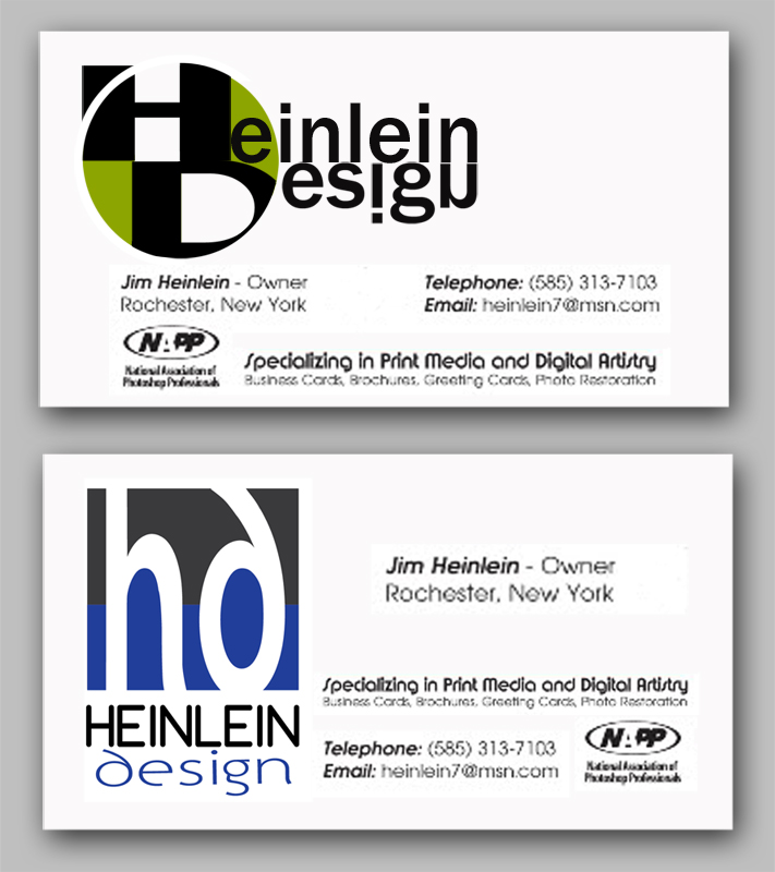
I like yours, my actually uses too many font styles.
|
ShootHerman

Location: Norway
|
 Mon Nov 12, 2012 4:11 pm Reply with quote Mon Nov 12, 2012 4:11 pm Reply with quote
Yes! Super cool![/quote]
Thx. Nice you liked it. 
Actually I got a little bit inspired of anfa, of the use of the cmyk values, in his logo.
Of course I see that you actually use the cmyk values in your logo now, but I like it the more clean way. IMO.
I hope you will find your own way to a new logo. Its funny to just make something and to help you to redesign your logo. 
ShootHerman
_________________
Fuck Putin.
|
Heinlein

Location: Rochester, New York
|
 Tue Nov 13, 2012 10:00 am Reply with quote Tue Nov 13, 2012 10:00 am Reply with quote
DaVinci wrote:
These are great! So many too choose from.
Thank you!
|
Trann

Location: Canadian Prairies, eh?
|
 Tue Nov 13, 2012 12:37 pm Reply with quote Tue Nov 13, 2012 12:37 pm Reply with quote
DaVinci wrote:
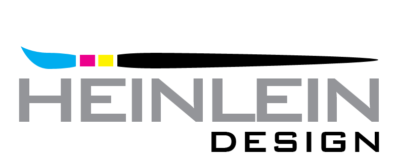
I love the simplicity of this and how the CMYK bars suggest a brush (at least, that's what I see). In fact, with just a few tweaks...
I surrender all claims to this modification to DaVinci.
|
vokaris
Site Moderator

|
 Tue Nov 13, 2012 12:51 pm Reply with quote Tue Nov 13, 2012 12:51 pm Reply with quote
Trann wrote: I love the simplicity of this and how the CMYK bars suggest a brush (at least, that's what I see). In fact, with just a few tweaks...
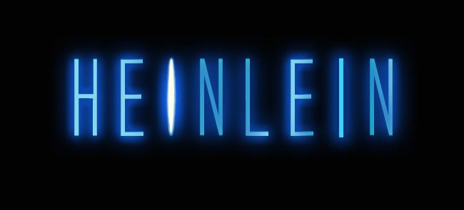
I surrender all claims to this modification to DaVinci. The kerning of HEINLEIN needs adjustment for a more pleasing spacing between the letters. e.g. the L is too close to the E
|
|
|
 Tue Nov 13, 2012 1:24 pm Reply with quote Tue Nov 13, 2012 1:24 pm Reply with quote
Trann wrote:
This is my fave thus far... I'll do another if I get a chance.
|
Trann

Location: Canadian Prairies, eh?
|
 Tue Nov 13, 2012 2:17 pm Reply with quote Tue Nov 13, 2012 2:17 pm Reply with quote
vokaris wrote: The kerning of HEINLEIN needs adjustment for a more pleasing spacing between the letters. e.g. the L is too close to the E
Agreed.
|
Goto page Previous 1, 2, 3, 4, 5, 6, 7, 8, 9 Next
Photoshop Contest Forum Index - Fun and Games - Heinlein Logo Contest - Reply to topic
You cannot post new topics in this forum
You cannot reply to topics in this forum
You cannot edit your posts in this forum
You cannot delete your posts in this forum
You cannot vote in polls in this forum
|
