Photoshop Contest PhotoshopContest.com
Creative Contests. Real Prizes. Essential Resource.
You are not logged in. Log in or Register


Photoshop Contest Forum Index - Featured Pic - assess this picture - Reply to topic

armogeden

Location: The other side of your screen

Post Fri Jan 27, 2006 12:30 pm   Reply with quote         


http://photoshopcontest.com/view-entry/93191/panic-room.html

im not vote whoring or anything because the comp has finished but im just wonderin...

which elements are good about this?
which are bad?
what aspects shouldn't be included in the final chop?
any aspects which would bring down amount of votes?

its just that i thought that this was by far the best work i'd done and it could reach the top few entries. btw i know there were other really good entries from hindsight but a man can hope.
sorry for asking an i'd be very grateful if you left feedback (please Crying or Very sad *beg*)


_________________
Please check out my student blog Smile
http://gdc1tombrushwood.blogspot.com/
Lets stick together, we won't lose our way
TofuTheGreat

Location: Back where I belong.

Post Fri Jan 27, 2006 12:44 pm   Reply with quote         


First things first. You're entry for that contest kicked mine's ass. Mine stunk worse than limberger cheese. Again just because I can pick stuff out doesn't mean I have the skills to back this up.

The things I notice are:
Prolem areas:
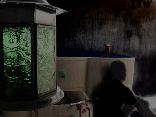
1. The blood spatter has problems. It's too bright in color and it looks like it's on the lens instead of on the dresser. Shadow work may solve both of those problems.
2. The open drawer has perspective problems and the wood grain on the top edge isn't correctly "bent".
3. The sillouette is good but for that amount of light we'd see some features on the lit portions.

Good Things:
1. The back wall and floor. Great job on that (IMHO). Simply great
2. The pill container on the dresser. Just enough in the shadow and very well lit.

Changes I'd make?
That's tougher question. The bulk of the image has an illustrative feel to it whilst the lantern is grounded in realistic. If you leave the lantern then match it to the style of the rest of the image. I think I'd have actually taken the lantern completely out. It's too heavy on that side. Plus it doesn't lend to the theme and instead distracts.


_________________
Why I do believe it's pants-less o'clock! - Lar deSouza
”The mind is like a parachute, it doesn’t work if it isn’t open.” - Frank Zappa
Created using photoshop and absolutely no talent. - reyrey

ReyRey

Location: In a world of $#!t

Post Fri Jan 27, 2006 1:00 pm   Reply with quote         


Please don't take anything in this thread personal but here it goes. Twisted Evil
The guy looks like a cardboard cutout with a beveled edge. The pill bottle is enormous (compare it to his head.) The guy can almost fit in the drawer and the knob is half the size of his head. The blood that is on the drawer looks like it is floating. Something that thick with that much bevel and emboss on it would cast a shadow on the drawer.That is some THICK blood. Almost like a thick paint. Also the guy would need two hands to hold that needle. It is huge.
Unless the guy is wearing a black body suit that covers his head too, he needs some color. Not just black. *Sorry but you asked*Crying or Very sad
Now on the good side, I love the mood, the lighting, the use of textures and muted colors to convey the feeling of a dirty, cold, grungy, sad world that this person is locked in.
Good job overall and the message was definately understood. Getting the point across is probably the hardest part of an illustration. Good job.. Wink


TofuTheGreat

Location: Back where I belong.

Post Fri Jan 27, 2006 1:21 pm   Reply with quote         


ReyRey wrote:
The pill bottle is enormous (compare it to his head.) The guy can almost fit in the drawer and the knob is half the size of his head. ... Also the guy would need two hands to hold that needle. It is huge.


Weird how two people see different things. I took the person to be a small child and not a full-grown adult.

And Rey's right. That needle is huge.


_________________
Why I do believe it's pants-less o'clock! - Lar deSouza
”The mind is like a parachute, it doesn’t work if it isn’t open.” - Frank Zappa
Created using photoshop and absolutely no talent. - reyrey

armogeden

Location: The other side of your screen

Post Fri Jan 27, 2006 1:42 pm   Reply with quote         


LOL! Laughing Laughing Laughing

but seriously...
thx a lot for the feedback, i really need this kind of talk. i'd just like to say that i tried to match the scaling on the guy but your right it did come off a little worse than i imagined, possibly tofu's rigth it's a child *shifty look*. also, i was trying to give it a "illustated" feel to it rather than realistic hence the thick blood and beveling with no detail on the guy. thanks for pointing out the shadow on the blood and the size of stuff. i think this is the best entry i've done as far as lighting is concerned. ill try and update it in a mo
thx a lot
tom


_________________
Please check out my student blog Smile
http://gdc1tombrushwood.blogspot.com/
Lets stick together, we won't lose our way
armogeden

Location: The other side of your screen

Post Fri Jan 27, 2006 2:08 pm   Reply with quote         


any better do you think?

made needle smaller
darkened blood
blood shadow
lightnened the details of the child slightly - but darkened rest of body
erm... Rolling Eyes


_________________
Please check out my student blog Smile
http://gdc1tombrushwood.blogspot.com/
Lets stick together, we won't lose our way
TofuTheGreat

Location: Back where I belong.

Post Fri Jan 27, 2006 3:02 pm   Reply with quote         


Looking good armo! Looks like you worked on the top edge of the drawer too.


_________________
Why I do believe it's pants-less o'clock! - Lar deSouza
”The mind is like a parachute, it doesn’t work if it isn’t open.” - Frank Zappa
Created using photoshop and absolutely no talent. - reyrey

sage

Location: Hudson, Canada

Post Fri Jan 27, 2006 7:34 pm   Reply with quote         


I really like the feeling of desolation you captured with this image. Rey's right about the difficulty in conveying a point through an illustration. I saw the things being pointed out here, but voted because I found the mood of your image very powerful.

That's it.


_________________
"Life is what happens to you while you are busy making other plans." John Lennon

Post Fri Jan 27, 2006 10:40 pm   Reply with quote         


About that pill bottle. Leave it how it is, because there are bottles that large, I have some here in my house.


_________________
"Recently, NASA scientists discovered that most people love to play video games but hate to die in fiery airplane crashes."
marcoballistic

Location: I am everywhere, and Nowhere, but mostly, I am right here!

Post Sat Jan 28, 2006 6:51 am   Reply with quote         


While there are some basic errors in the image, I thought it was a very atmospheric pice of work, and I agree with Armo, for the time he has been a member, and the work he has produced, this is a great entry.

And it was undervoted greatly for that reason. But like we were saying a while back Rey, some people get overlooked alot here, it is a shame, but it does change.

keep it up Armo, your doing some great work IMO.


Photoshop Contest Forum Index - Featured Pic - assess this picture - Reply to topic

You cannot post new topics in this forum
You cannot reply to topics in this forum
You cannot edit your posts in this forum
You cannot delete your posts in this forum
You cannot vote in polls in this forum


Navigate PSC
Contests open  completed  winners  prizes  events  rules  rss 
Galleries votes  authentic  skillful  funny  creative  theme  winners 
Interact register  log in/out  forum  chat  user lookup  contact 
Stats monthly leaders  hall of fame  record holders 
PSC advantage  news (rss)  faq  about  links  contact  home 
Help faq  search  new users  tutorials  contact  password 

Adobe, the Adobe logo, Adobe Photoshop, Creative Suite and Illustrator are registered trademarks of Adobe Systems Incorporated.
Text and images copyright © 2000-2006 Photoshop Contest. All rights reserved.
A venture of ExpertRating.com