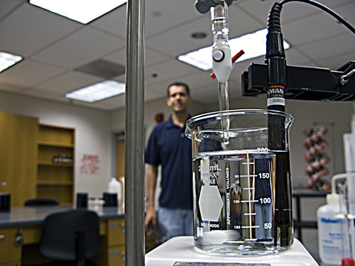
Tarmac wrote:
Cpt.Smitty, The steam seems too close in hue with the brick wall, JMO. It almost looks like cracks rather than rising moisture. The shadowing is great though. Maybe you could add more curvature on the numbers to match the curvature of the word Poison, also the beaker looks a little off center or floating above the hot plate. Otherwise, very nice work!
Tarmac i got a few comments or pms about the base and the beaker looking off center and looking back i see exactly what you mean.
What i was going for was to make it look like they were one piece. The black rubber bottom sloping up into the glass and an angle. But all it looks like is an off center base.
Any ideas on how i could have made it look like one, angled, connected piece?
[ ]
[ Beaker ]
[ ]
[ ]
/ angle \
[ Base ] <<<<<kinda like this


