Photoshop Contest PhotoshopContest.com
Creative Contests. Real Prizes. Essential Resource.
You are not logged in. Log in or Register


Photoshop Contest Forum Index - Tutorials - Do you like Garlic? - Reply to topic

Goto page 1, 2  Next

Heinlein

Location: Rochester, New York

Post Wed Aug 25, 2010 10:34 am   Reply with quote         


Hey everyone!

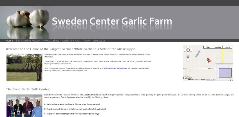
Check out my first website that I designed for a Garlic farmer in NY.

http://www.scgarlic.com

Please let me know your thoughts, as website design is new for me.

Thanks,
Jim Smile


_________________

Tesore

Location: On the way to Utopia!

Post Wed Aug 25, 2010 12:15 pm   Reply with quote         


I saw it already via facebook, its cool! Nice coloring, very fast, google E-map, great photo's and I love garlic. Kudo's!!!
What program did you use?

Very Happy


Heinlein

Location: Rochester, New York

Post Wed Aug 25, 2010 12:26 pm   Reply with quote         


Tesore wrote:
I saw it already via facebook, its cool! Nice coloring, very fast, google E-map, great photo's and I love garlic. Kudo's!!!
What program did you use?

Very Happy


Thank you so much!

I actually used a Content Management System (CMS) I designed all the graphics including the header.


_________________

Tesore

Location: On the way to Utopia!

Post Wed Aug 25, 2010 12:37 pm   Reply with quote         


I know CMS, nice and easy.
The homepage is awesome... the grey and white makes it a real eyechatcher!!!
Bow

A new career! Very Happy


*Can't find your font so fast*

Laughing


Post Wed Aug 25, 2010 2:51 pm   Reply with quote         


As I'm sure you're aware, Hans Von Ollaf's masterpiece, "Bjorn's Fields", set the bar impossibly high for Swedish garlic websites.

That being said, your design is one of the best garlic farm websites I've seen in quite some time.

If I had to critique something, the only thing I'd improve is the part with the garlic.
Other than that, great work!


Heinlein

Location: Rochester, New York

Post Wed Aug 25, 2010 3:25 pm   Reply with quote         


badcop wrote:
As I'm sure you're aware, Hans Von Ollaf's masterpiece, "Bjorn's Fields", set the bar impossibly high for Swedish garlic websites.

That being said, your design is one of the best garlic farm websites I've seen in quite some time.

If I had to critique something, the only thing I'd improve is the part with the garlic.
Other than that, great work!


Thanks badcop! I really appreciate the feedback Smile


_________________

TofuTheGreat

Location: Back where I belong.

Post Wed Aug 25, 2010 5:58 pm   Reply with quote         


My main concern would be that your layout's header doesn't scale for the browser window? The dynamic thumbnail sizer is cool. Mayhaps you could use the same technique for the header too?

Which CMS did you use? Drupal, Joomla, Wordpress, Wix, etc.?


_________________
Why I do believe it's pants-less o'clock! - Lar deSouza
”The mind is like a parachute, it doesn’t work if it isn’t open.” - Frank Zappa
Created using photoshop and absolutely no talent. - reyrey

Heinlein

Location: Rochester, New York

Post Thu Aug 26, 2010 7:43 am   Reply with quote         


TofuTheGreat wrote:
My main concern would be that your layout's header doesn't scale for the browser window? The dynamic thumbnail sizer is cool. Mayhaps you could use the same technique for the header too?

Which CMS did you use? Drupal, Joomla, Wordpress, Wix, etc.?


Thanks Tofu. It is actually a drag and drop application with ipage.com. I know what you mean about the header. It seems to be more of a problem with Firefox than the other browsers.


_________________

TheBullShark

Location: Deep

Post Thu Aug 26, 2010 8:30 am   Reply with quote         


Nice site... as a garlic lover (yes sharks like garlic too... thats why we prefer to eat Italians!) I have always wanted to know how it was grown etc. Very cool, and feel the site is interesting yet uncomplicated which is my favorite type! WD! Banana


Michel

Location: Montreal, Canada

Post Fri Aug 27, 2010 9:54 pm   Reply with quote         


The general look is simple, modern and clean. Good choice on the Lightbox gallery. The pictures could have captions though.

The only thing I don't understand is the menu, aligned to the right and the 150px left margin of the div.content


In the above screen capture I added a 40px left padding to ul.header, took off its text-align:right and changed the div.content margin-left to 20px. Just a suggestion.


soulrock

Location: I'm not so sure where am I......

Post Fri Aug 27, 2010 10:44 pm   Reply with quote         


Great Mr. Jim! Yes, Michel is right IMO. And give some room for your menus IMO!


Heinlein

Location: Rochester, New York

Post Sat Aug 28, 2010 9:49 am   Reply with quote         


Michel wrote:
The general look is simple, modern and clean. Good choice on the Lightbox gallery. The pictures could have captions though.

The only thing I don't understand is the menu, aligned to the right and the 150px left margin of the div.content


In the above screen capture I added a 40px left padding to ul.header, took off its text-align:right and changed the div.content margin-left to 20px. Just a suggestion.


Thanks Michel, I really appreciate the advice.

When I get some time, I will try to fix the menu.


_________________

Heinlein

Location: Rochester, New York

Post Tue Aug 31, 2010 12:34 pm   Reply with quote         


Who likes Garlic?


_________________

Tesore

Location: On the way to Utopia!

Post Tue Aug 31, 2010 12:50 pm   Reply with quote         


Love it!
Wink


SCWIDVICIOUS

Location: pfft..

Post Fri Sep 03, 2010 2:43 pm   Reply with quote         


OK, I will be bold and honest. Here is what I see...

The site is smooth and clean looking, I like that. looks nice.
what I dont like are the lack of interactions, I have no reason to go back unless I simply want to order garlic.. and I love garlic. but its not memorable . It needs personality.


Send a message to order.

I would suggest some type of merchant/cart type of placement..
or at least specify how the payments are taken.

Do they take credit cards, checks, phone orders?
Are we supposed to put the credit card info into the contact form? There is no security cert, https://
Coming form a ecommerce merchant, i can tell you the customers want to know how to buy, how they can pay, and when they are doing so, that it is secure. People like automation. they dont necessarily want to tell a human their card number.

They dont want to have to set by the phone for *what duration of time* waiting for the company to call them. they have things to do....
-------

recipes section that updates daily or weekly, something to make people have a reason to come back

Sign up for a news letter?

What have our satisfied customers been saying?

What are our customers doing with their garlic? Let the customers place reviews, send in pictures of their latest creations.

those are all forms of SEO, they make people come back..
If a site stays dormant, google will assume the owner fell asleep, rank will drop or wont rise.

It needs to be updated constantly..


_________________
..

Goto page 1, 2  Next

Photoshop Contest Forum Index - Tutorials - Do you like Garlic? - Reply to topic

You cannot post new topics in this forum
You cannot reply to topics in this forum
You cannot edit your posts in this forum
You cannot delete your posts in this forum
You cannot vote in polls in this forum


Navigate PSC
Contests open  completed  winners  prizes  events  rules  rss 
Galleries votes  authentic  skillful  funny  creative  theme  winners 
Interact register  log in/out  forum  chat  user lookup  contact 
Stats monthly leaders  hall of fame  record holders 
PSC advantage  news (rss)  faq  about  links  contact  home 
Help faq  search  new users  tutorials  contact  password 

Adobe, the Adobe logo, Adobe Photoshop, Creative Suite and Illustrator are registered trademarks of Adobe Systems Incorporated.
Text and images copyright © 2000-2006 Photoshop Contest. All rights reserved.
A venture of ExpertRating.com